| |
|
View Poll Results: Round 3 Voting
|
1: 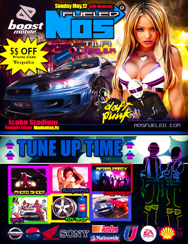 [/URL] [/URL]
|
   
|
5 |
62.50% |
2: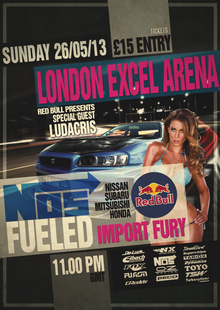
|
   
|
3 |
37.50% |

05-11-2013, 05:37 PM
|
Join Date: Oct 2008
Posts: 6,624
Mentioned: 1207 Post(s)
Tagged: 36 Thread(s)
|
 Voting Swift Vs V3numb (Round 3)
Swift Vs V3numb
Round #3 Voting Thread
USE THE DAMN RUBRIC
rate from 1-10 for each category followed by a few sentences for each entry
Names are unonnymous to avoid Dickriding and hate voting.. so this is purely on skill alone and no biases aloud.. the entries are voted for either #1 or #2
Important
Voting will be voted upon using the GFX rubric (Click HERE for rubric and if you need definitions for the words click Here ), Failure will result in a non eligible vote.
Use this for a guideline:
Composition - Are both sides equal? Or does one side look heavier than the other (Does the left have more effects/objects than the right leaving the right side feel empty?
Negatives: All the effects/objects on one side.
Colors - Do the color choices compliment eachother? Are they monotone, or to saturated? Do they visualy stimulate you?
Negatives: Monotone, or to saturated, colors that contrast poorly.
Lighting- Is the lighting realistic? Is their shadows? Is their depth within the tag caused by lighting? Is it possitioned correctly?
Negatives: The lighting is not facing the focal, the lighting is not shining on the focal.
Blending - Does the focal appear to be part of the tag or on top of it? The focal should be part of it, blended into the tag as if it should be there.
Negatives: The tag doesnt feel whole, the render just look added on this no attempt or effort to make it match the background.
Flow - Does the objects or design follow the flow of the focals body, or the flow of the focals individual sections and or limbs?
Negatives: think of the objects as lines, typically going in a direction. Do the lines create an X? If the lines creat an X, the flow is poor.
Style - Is the style creative?
Negatives: Bland, lacking of creativity.
Depth - Does the signature feel flat? or does it feel like there is distance?
Neggatives: Signature looks flat, less action.
@ Swift
__________________
 "Draw to your hearts desire
and keep it
CLASSICK YA ASIAN BASTIDDD"
(DJ Denton)
Quote:
Originally Posted by Dave

|
Quote:
Originally Posted by Punk The God

ahh.. yea your a good fucker.. |
My Gallery
HERE

|
 05-11-2013, 05:37 PM
|
#1
|
          Basic Audio Record
0 Points / 0 Won / 1 Lost
Exclusive Audio Record
0 Points / Won / Lost
          Basic Text Record
1171 Points / 120 Won / 41 Lost
Exclusive Text Record
0 Points / 0 Won / 1 Lost
Join Date: Oct 2008
Voted:
24
audio / 630
text
Posts: 6,624
Mentioned: 1207 Post(s)
Tagged: 36 Thread(s)
|
 Voting Swift Vs V3numb (Round 3)
Swift Vs V3numb
Round #3 Voting Thread
USE THE DAMN RUBRIC
rate from 1-10 for each category followed by a few sentences for each entry
Names are unonnymous to avoid Dickriding and hate voting.. so this is purely on skill alone and no biases aloud.. the entries are voted for either #1 or #2
Important
Voting will be voted upon using the GFX rubric (Click HERE for rubric and if you need definitions for the words click Here ), Failure will result in a non eligible vote.
Use this for a guideline:
Composition - Are both sides equal? Or does one side look heavier than the other (Does the left have more effects/objects than the right leaving the right side feel empty?
Negatives: All the effects/objects on one side.
Colors - Do the color choices compliment eachother? Are they monotone, or to saturated? Do they visualy stimulate you?
Negatives: Monotone, or to saturated, colors that contrast poorly.
Lighting- Is the lighting realistic? Is their shadows? Is their depth within the tag caused by lighting? Is it possitioned correctly?
Negatives: The lighting is not facing the focal, the lighting is not shining on the focal.
Blending - Does the focal appear to be part of the tag or on top of it? The focal should be part of it, blended into the tag as if it should be there.
Negatives: The tag doesnt feel whole, the render just look added on this no attempt or effort to make it match the background.
Flow - Does the objects or design follow the flow of the focals body, or the flow of the focals individual sections and or limbs?
Negatives: think of the objects as lines, typically going in a direction. Do the lines create an X? If the lines creat an X, the flow is poor.
Style - Is the style creative?
Negatives: Bland, lacking of creativity.
Depth - Does the signature feel flat? or does it feel like there is distance?
Neggatives: Signature looks flat, less action.
@ Swift
__________________
 "Draw to your hearts desire
and keep it
CLASSICK YA ASIAN BASTIDDD"
(DJ Denton)

Quote:
Originally Posted by Dave

|
Quote:
Originally Posted by Punk The God

ahh.. yea your a good fucker.. |
My Gallery
HERE

|
|
Offline
|
|

05-11-2013, 07:02 PM
|
Join Date: Mar 2010
Posts: 3,547
Mentioned: 746 Post(s)
Tagged: 29 Thread(s)
|

Composition - 1.) -8- I felt was very extravagent and had a flurry of colors equally distributed and gave off the esence of massive creativity. To the smokey yellow fading off that asian to the right top to the deep blues fading in and out of the whip the whip. Which leads to the boottom which was very evenly distributed and also well put together.
2.) -5- Basically a mix of only three colors: from top right to top left it is basically just the same shade of grey, with slight accents of off white and pink, including lettering BUT leaving much empty space. The bottom left and right were most definatly better but in comparison to colors/depths it didn't touch the first IMO, nicely done but nowhere near as accentric.....
Colors - 1.) -8- It was filled w/ a multitude of colors that complimented eachother to that of a rainbow in the sense it came off so naturally. A work of art \
2.) -4- Very monotone in top and other areas. The choice of dominant grey was not a good choice in my opinon. Although the bottom did have a few more colors they wren't blended well and overall were pretty plain when comparing to the one above it in this occasion....
Lighting- -9- 1.) I found the lighting to be very realistic and especially on the car, through out it appeared as almost perfect positioninging of shadows and you can tell this person took alot of time to kae it that way. In addition everyting on the cover was in proportion and equivellent to eachother, the way the top transitioned from big to smaller with colored off boxes ranging the aaray of activities at the event, well done.
-6- 2.) The lighting was much poorer and it almost had a blochy essence to it in places IMO. In the places that there wrre shadows, which shows this person made the effort, but i felt thet didn't do an up to par job on the cover, also the lighting of the logos on the bottom were all the same giving it a bland feel, the entirity had a generic over tone of color and shadowing...
Blending - -9- EXCELLENTLY blended, a job well done to say the very least. The way smoke poured in a yellow thick vapor to a string of rays connected like she came that way out of the womb. The car, spray can and all logos appeared to be apart of the picture rather than on top and that goes for the fellow in front of the asian and the two at the bottom of the page. In its entiriety it's a wonderful piece that blended almost to perfection.
-6.5- I hate to give such a low score for this but in comparison it really is a poor job from m aspect. Where the first seemed to utilze the technques in a professional manner,(blending,lighting), the other paled in comparison with what seems a tenuous grasp on the art form. Although blended, the bitch, the car and the words in the middle to lower section it was really lowered the score for me....
Flow - -10- 1.) The only reason i give this high score is because i felt it really was almost perfect. As stated earlier, what really caught my eye was the way the smoke wraped arpund the chicks body like a hand made of smoke. Also the flow from top to bottom of the cover was very smooth and transitioed well with the overall scheme of the piece.
-7- 2.) By the rubric in this second one i can kind of see what was stated by the X.. but only slightly reason being the score isn't a point lower because at time it flowed nicely over several focal points and was extremely smooth. Simplicity is what really hurt this GFX in the end, because the objects, again as stated earlier jst did not blend well in certain places which to me can have a real effect on the flow of the picture...
Style - -9- 1.)A very well orchastrated artistic piece. To be honest i was impressed with professinality utilzing all of the techniches ina manner that ended being one fof the nicest cover arts I have seen on Lb, ever. Additionaly i felt it ws VERY creative from the smokey asaian lol, which i've mentioned several times, to the whip and the well transitioned bottom including a well GFXed number of the activities.
2.) -7-I can tell this person put work into their piece bitut they are lacking alot of originality. First, and foremost, the bitch in picture one is way fier than the bitch in picture two lmao, but seriously. And the overall grey tone and just slight use of other colors did not give it much style or show much use of creativity. Lastly, internally you literally can feel the emtion of the picture and while number one struck a cord w/ me and the other left me feeling empty, possibly due to several empty spots in the art....
Depth - -9- 1.) That asian chicks tities to the front end of the fender were practically hologrphic. Now certain area did have slight feel to it but for 95% of the GFX it was practically.
-6- 2.) Where the first did pop out at me the second did not as much at all. One of the biggest roblems with yur picture my dude was the fact you put most of the real work, as i see it, in the bottom where top looks like it could have just taken you 15 minutes.
My vote: 1
Congrats to both for all their work!!!!
__________________
LETHAL DOSES OF BARS


|
 05-11-2013, 07:02 PM
|
#2
|
          Basic Audio Record
136 Points / 19 Won / 11 Lost
Exclusive Audio Record
0 Points / Won / Lost
          Basic Text Record
3815 Points / 342 Won / 112 Lost
Exclusive Text Record
50 Points / 5 Won / 2 Lost
Join Date: Mar 2010
Voted:
35
audio / 1302
text
Posts: 3,547
Mentioned: 746 Post(s)
Tagged: 29 Thread(s)
|

Composition - 1.) -8- I felt was very extravagent and had a flurry of colors equally distributed and gave off the esence of massive creativity. To the smokey yellow fading off that asian to the right top to the deep blues fading in and out of the whip the whip. Which leads to the boottom which was very evenly distributed and also well put together.
2.) -5- Basically a mix of only three colors: from top right to top left it is basically just the same shade of grey, with slight accents of off white and pink, including lettering BUT leaving much empty space. The bottom left and right were most definatly better but in comparison to colors/depths it didn't touch the first IMO, nicely done but nowhere near as accentric.....
Colors - 1.) -8- It was filled w/ a multitude of colors that complimented eachother to that of a rainbow in the sense it came off so naturally. A work of art \
2.) -4- Very monotone in top and other areas. The choice of dominant grey was not a good choice in my opinon. Although the bottom did have a few more colors they wren't blended well and overall were pretty plain when comparing to the one above it in this occasion....
Lighting- -9- 1.) I found the lighting to be very realistic and especially on the car, through out it appeared as almost perfect positioninging of shadows and you can tell this person took alot of time to kae it that way. In addition everyting on the cover was in proportion and equivellent to eachother, the way the top transitioned from big to smaller with colored off boxes ranging the aaray of activities at the event, well done.
-6- 2.) The lighting was much poorer and it almost had a blochy essence to it in places IMO. In the places that there wrre shadows, which shows this person made the effort, but i felt thet didn't do an up to par job on the cover, also the lighting of the logos on the bottom were all the same giving it a bland feel, the entirity had a generic over tone of color and shadowing...
Blending - -9- EXCELLENTLY blended, a job well done to say the very least. The way smoke poured in a yellow thick vapor to a string of rays connected like she came that way out of the womb. The car, spray can and all logos appeared to be apart of the picture rather than on top and that goes for the fellow in front of the asian and the two at the bottom of the page. In its entiriety it's a wonderful piece that blended almost to perfection.
-6.5- I hate to give such a low score for this but in comparison it really is a poor job from m aspect. Where the first seemed to utilze the technques in a professional manner,(blending,lighting), the other paled in comparison with what seems a tenuous grasp on the art form. Although blended, the bitch, the car and the words in the middle to lower section it was really lowered the score for me....
Flow - -10- 1.) The only reason i give this high score is because i felt it really was almost perfect. As stated earlier, what really caught my eye was the way the smoke wraped arpund the chicks body like a hand made of smoke. Also the flow from top to bottom of the cover was very smooth and transitioed well with the overall scheme of the piece.
-7- 2.) By the rubric in this second one i can kind of see what was stated by the X.. but only slightly reason being the score isn't a point lower because at time it flowed nicely over several focal points and was extremely smooth. Simplicity is what really hurt this GFX in the end, because the objects, again as stated earlier jst did not blend well in certain places which to me can have a real effect on the flow of the picture...
Style - -9- 1.)A very well orchastrated artistic piece. To be honest i was impressed with professinality utilzing all of the techniches ina manner that ended being one fof the nicest cover arts I have seen on Lb, ever. Additionaly i felt it ws VERY creative from the smokey asaian lol, which i've mentioned several times, to the whip and the well transitioned bottom including a well GFXed number of the activities.
2.) -7-I can tell this person put work into their piece bitut they are lacking alot of originality. First, and foremost, the bitch in picture one is way fier than the bitch in picture two lmao, but seriously. And the overall grey tone and just slight use of other colors did not give it much style or show much use of creativity. Lastly, internally you literally can feel the emtion of the picture and while number one struck a cord w/ me and the other left me feeling empty, possibly due to several empty spots in the art....
Depth - -9- 1.) That asian chicks tities to the front end of the fender were practically hologrphic. Now certain area did have slight feel to it but for 95% of the GFX it was practically.
-6- 2.) Where the first did pop out at me the second did not as much at all. One of the biggest roblems with yur picture my dude was the fact you put most of the real work, as i see it, in the bottom where top looks like it could have just taken you 15 minutes.
My vote: 1
Congrats to both for all their work!!!!
__________________
LETHAL DOSES OF BARS


|
|
Offline
|
|

05-11-2013, 08:06 PM
|
Join Date: Oct 2006
Posts: 6,018
Mentioned: 1298 Post(s)
Tagged: 51 Thread(s)
|

Yo, shouts to both for doing this, was a good idea and both produced some awesome work. This shit is subjective so it's just going to be personal preference for me.
Composition
1 - 7 - I think the 'composition' is pretty dope on the top half, it's all in proportion but the bottom half looks a bit weird, should have cut the racing dudes out or put one each side. It would have looked cool like it is if it was on top, but it's made the whole thing look a bit top heavy if you feeeeeel me.
2 - 6 - I thought this before I even looked at the voting rubix, it looks like it's pulling to the right too much. Trust me if the car was just over to the left a little bit more it would have got a 9 because the rest is gooch.
Colours
1 - 7 - Personally, I hate neon shit and brights clashing colours, but it definitely fitted the theme and it was done quite well. Kind of like a rave scene / Tokyo Drift thing going on so it was done well, but as a personal choice naaa son.
2 - 7 - The opposite to the first one, I found it kind of boring and wouldn't have picked those colours for the theme, but they did match up with each other and it does look good together.
Lighting
1 - 9 - Yo lighting was dope on this, showed the girl in the light and the car in a darker night time look to make the girl in the spot light and the car outside, definitely looks cool.
2 - 8 - I think the lighting on the car looks dope, but the girl doesn't stand out enough, but you get a high mark just for making the car looks as cool and shiny as it does.
Blending
1 - 4 - To be honest it looks a bit messy, like the homies under the girls boobs, they looks awful there, not blended at it, looks like somebody's just put stickers on a poster, same with the NOS can and the star thing.
2 - 9 - Almost perfect, I think the girl could of been blended better, but the way the car and the banners were blended with the text etc is pure crack brother.
Flow
1 - 6 - This it was a bit too abstract and not a lot of flow to be honest, I mean the abstract looks has it positives but also there's something things that look way too out of place.
2 - 9 - The whole alignment of the text and banners against the car was good. Looked like a professional magazine colour in this sense. Definitely one of the stronger points, killed it.
Style
1 - 8 - Definitely creative and abstract and a lot going on, it's eye catching and the bright colours definitely make it fit the style of the theme and I'd imagine the whole piece reflects the artists style, I say this because I think I might know who it belongs to because it follows a style from other work I've seen from them.
2 - 9 - I loved how simple but effective and chic this is. People might think it lacks creativity because it's quite plain but personally that's my favourite style, I'm in to marketing that's what I do and it's the sort of stuff I'd print out and hand out as flyer or posters. The whole style of this artist is definitely my personal preference.
Depth
1 - 7 - this could of scored higher if it was a bit simpler, there's a lot of depth on the top and there are some spaces with depth on the bottom, but again those homies under that bitch's tits take away from the depth because they just look like they've been randomly placed on something which originally had a bit of a 3D look to it.
2 - 9 - The way the artist made the banners see through added a lot of depth to this and the lighting of the car makes it look a bit 3D also. Also the use of blurring and focusing on the car added depth also, great job.
Could of other notes, I think the fonts in the second piece really won this for me, the use of text in the first was bare messy, wasn't defined enough and from a marketing piece of view you NEED to inform the viewer of all the details for it to be an effective advertisement and I don't think you'd id this. I didn't notice the Tia Tequila stuff until the last look. Both did a good job and met the theme well and took 2 very different approaches and I honestly think they would both work well with a bit of tweaking and I'd be happy to let either of you design flyers for an event I was holding (and also pay you) so great job. But..
Winner - 2
|
 05-11-2013, 08:06 PM
|
#3
|
|
Live Battler
          Basic Audio Record
54 Points / 4 Won / 1 Lost
Exclusive Audio Record
0 Points / Won / Lost
          Basic Text Record
1979 Points / 153 Won / 28 Lost
Exclusive Text Record
53 Points / 3 Won / 0 Lost
Join Date: Oct 2006
Voted:
0 audio / 1239
text
Posts: 6,018
Mentioned: 1298 Post(s)
Tagged: 51 Thread(s)
|

Yo, shouts to both for doing this, was a good idea and both produced some awesome work. This shit is subjective so it's just going to be personal preference for me.
Composition
1 - 7 - I think the 'composition' is pretty dope on the top half, it's all in proportion but the bottom half looks a bit weird, should have cut the racing dudes out or put one each side. It would have looked cool like it is if it was on top, but it's made the whole thing look a bit top heavy if you feeeeeel me.
2 - 6 - I thought this before I even looked at the voting rubix, it looks like it's pulling to the right too much. Trust me if the car was just over to the left a little bit more it would have got a 9 because the rest is gooch.
Colours
1 - 7 - Personally, I hate neon shit and brights clashing colours, but it definitely fitted the theme and it was done quite well. Kind of like a rave scene / Tokyo Drift thing going on so it was done well, but as a personal choice naaa son.
2 - 7 - The opposite to the first one, I found it kind of boring and wouldn't have picked those colours for the theme, but they did match up with each other and it does look good together.
Lighting
1 - 9 - Yo lighting was dope on this, showed the girl in the light and the car in a darker night time look to make the girl in the spot light and the car outside, definitely looks cool.
2 - 8 - I think the lighting on the car looks dope, but the girl doesn't stand out enough, but you get a high mark just for making the car looks as cool and shiny as it does.
Blending
1 - 4 - To be honest it looks a bit messy, like the homies under the girls boobs, they looks awful there, not blended at it, looks like somebody's just put stickers on a poster, same with the NOS can and the star thing.
2 - 9 - Almost perfect, I think the girl could of been blended better, but the way the car and the banners were blended with the text etc is pure crack brother.
Flow
1 - 6 - This it was a bit too abstract and not a lot of flow to be honest, I mean the abstract looks has it positives but also there's something things that look way too out of place.
2 - 9 - The whole alignment of the text and banners against the car was good. Looked like a professional magazine colour in this sense. Definitely one of the stronger points, killed it.
Style
1 - 8 - Definitely creative and abstract and a lot going on, it's eye catching and the bright colours definitely make it fit the style of the theme and I'd imagine the whole piece reflects the artists style, I say this because I think I might know who it belongs to because it follows a style from other work I've seen from them.
2 - 9 - I loved how simple but effective and chic this is. People might think it lacks creativity because it's quite plain but personally that's my favourite style, I'm in to marketing that's what I do and it's the sort of stuff I'd print out and hand out as flyer or posters. The whole style of this artist is definitely my personal preference.
Depth
1 - 7 - this could of scored higher if it was a bit simpler, there's a lot of depth on the top and there are some spaces with depth on the bottom, but again those homies under that bitch's tits take away from the depth because they just look like they've been randomly placed on something which originally had a bit of a 3D look to it.
2 - 9 - The way the artist made the banners see through added a lot of depth to this and the lighting of the car makes it look a bit 3D also. Also the use of blurring and focusing on the car added depth also, great job.
Could of other notes, I think the fonts in the second piece really won this for me, the use of text in the first was bare messy, wasn't defined enough and from a marketing piece of view you NEED to inform the viewer of all the details for it to be an effective advertisement and I don't think you'd id this. I didn't notice the Tia Tequila stuff until the last look. Both did a good job and met the theme well and took 2 very different approaches and I honestly think they would both work well with a bit of tweaking and I'd be happy to let either of you design flyers for an event I was holding (and also pay you) so great job. But..
Winner - 2
|
|
Offline
|
|

05-11-2013, 10:23 PM
|
Join Date: Oct 2008
Posts: 6,624
Mentioned: 1207 Post(s)
Tagged: 36 Thread(s)
|
bump..
__________________
 "Draw to your hearts desire
and keep it
CLASSICK YA ASIAN BASTIDDD"
(DJ Denton)

Quote:
Originally Posted by Dave

|
Quote:
Originally Posted by Punk The God

ahh.. yea your a good fucker.. |
My Gallery
HERE

|

05-11-2013, 11:47 PM
|
Join Date: Apr 2007
Posts: 438
Mentioned: 75 Post(s)
Tagged: 3 Thread(s)
|
deleted my fuckin expo...i will be bak to do it again, just not right now!!aaaaaaaahhhh
__________________
Quote:
|
Originally Posted by TRE
North East (Exclusive Member) [PM North East] [Ban North East] [View Profile]
Checking Audio Battles
Clean... no cheating detected
Checking Text Battles
Clean... no cheating detected
|
^^^^ CHEATS TRY TO BEAT THAT FUCKIN RECORD!! ^^^^
AND STOP ACTING LIKE A BITCH!!!!!!!!!!!    
Alot of people talk shit and say "send it"....come with action not words, dont worry i dont back down.
|

05-12-2013, 02:24 AM
|
Join Date: Oct 2008
Posts: 6,624
Mentioned: 1207 Post(s)
Tagged: 36 Thread(s)
|
@ Boss_MC dont forget now.. it's only open for a week
__________________
 "Draw to your hearts desire
and keep it
CLASSICK YA ASIAN BASTIDDD"
(DJ Denton)

Quote:
Originally Posted by Dave

|
Quote:
Originally Posted by Punk The God

ahh.. yea your a good fucker.. |
My Gallery
HERE

|

05-12-2013, 08:51 PM
|
Posts: n/a
Mentioned: Post(s)
Tagged: Thread(s)
|

First time I'm going to use the rubrics. Mainly because it's very hard to vote on, and I'll need guidelines for myself.
Composition: Not really relevant for this kind of challenge.
Colours: 1. This was pretty easy. While the 2nd one was a more matte style, the first one uses colours very well to it's advantage. It can be a risk using this style, but I dont feel it was in this case and it was a landslide in this category.
Lighting: 1. Again, not the most relevant for this kind of challenge, but the highlighting behind Tila was a big factor in this.
Blending: 2. In the 1st, I didn't like a lot of the renders being unblended. The top left logo still has some slight white pixels on it from a bad cut, there is an unblended NOS can floating around, and there was no effort to do anything with the main part which was the car. We still see the reflections of whatever was on the side of the picture, and I don't feel that was good for this. The second doesnt really have any blending issues, which gives it the category automatically.
Flow: 2. In the 1st, there isn't too much flow involved. I think the key part is the smoke behind Tila. I felt it was in great contrast to her render, and it came out brilliantly. The second has the entire background flowing with the car, and although it could have been slightly blended in a bit more, I felt that since the whole picture was in movement with our focal point, it has to take the cat.
Style: 1. The 2nd went down a very generic route. The sponsors were in the usual spot, the background being a corner with a drifting car. It wasn't the most creative piece I've ever seen. The first used some different things in there, especially with the lower half of the piece, and although some technical difficulties with the standard city background and the car not being blended in, the original touches alone easily takes this cat.
Depth: 2. Again it was just down to the fact that the BG was fitted to the car. The car was the correct size and fit for the road, while the 1st piece didnt have any of that at it's disposal.
Thanks a fucking lot cats. It's REALLY close. I think with text, the slight grunge work on the slight gradients of the objects, the background being fitted with the car, the decent blending, the 2nd displays the superior GFX skills. The first is an original and attractive piece that catches your eye instantly, and at the end of the day, this is a flyer contest. My winner is the one that would be my pick if I was selling this product, and that has to be the 1st.
GMV: 1
|
 05-12-2013, 08:51 PM
|
#7
|
|
Guest
Voted:
0 audio / 0 text
Posts: n/a
Mentioned: Post(s)
Tagged: Thread(s)
|

First time I'm going to use the rubrics. Mainly because it's very hard to vote on, and I'll need guidelines for myself.
Composition: Not really relevant for this kind of challenge.
Colours: 1. This was pretty easy. While the 2nd one was a more matte style, the first one uses colours very well to it's advantage. It can be a risk using this style, but I dont feel it was in this case and it was a landslide in this category.
Lighting: 1. Again, not the most relevant for this kind of challenge, but the highlighting behind Tila was a big factor in this.
Blending: 2. In the 1st, I didn't like a lot of the renders being unblended. The top left logo still has some slight white pixels on it from a bad cut, there is an unblended NOS can floating around, and there was no effort to do anything with the main part which was the car. We still see the reflections of whatever was on the side of the picture, and I don't feel that was good for this. The second doesnt really have any blending issues, which gives it the category automatically.
Flow: 2. In the 1st, there isn't too much flow involved. I think the key part is the smoke behind Tila. I felt it was in great contrast to her render, and it came out brilliantly. The second has the entire background flowing with the car, and although it could have been slightly blended in a bit more, I felt that since the whole picture was in movement with our focal point, it has to take the cat.
Style: 1. The 2nd went down a very generic route. The sponsors were in the usual spot, the background being a corner with a drifting car. It wasn't the most creative piece I've ever seen. The first used some different things in there, especially with the lower half of the piece, and although some technical difficulties with the standard city background and the car not being blended in, the original touches alone easily takes this cat.
Depth: 2. Again it was just down to the fact that the BG was fitted to the car. The car was the correct size and fit for the road, while the 1st piece didnt have any of that at it's disposal.
Thanks a fucking lot cats. It's REALLY close. I think with text, the slight grunge work on the slight gradients of the objects, the background being fitted with the car, the decent blending, the 2nd displays the superior GFX skills. The first is an original and attractive piece that catches your eye instantly, and at the end of the day, this is a flyer contest. My winner is the one that would be my pick if I was selling this product, and that has to be the 1st.
GMV: 1
|
|
|
|

05-13-2013, 02:15 PM
|
Join Date: Oct 2008
Posts: 6,624
Mentioned: 1207 Post(s)
Tagged: 36 Thread(s)
|
bUmP...
__________________
 "Draw to your hearts desire
and keep it
CLASSICK YA ASIAN BASTIDDD"
(DJ Denton)

Quote:
Originally Posted by Dave

|
Quote:
Originally Posted by Punk The God

ahh.. yea your a good fucker.. |
My Gallery
HERE

|

05-13-2013, 07:52 PM
|
Join Date: Jul 2010
Posts: 11,685
Mentioned: 2041 Post(s)
Tagged: 81 Thread(s)
|
finna smoke this over.
__________________
I am a Goon.

Goon Shrugging hoes, Daily.
|

05-13-2013, 08:23 PM
|
Join Date: Oct 2008
Posts: 6,624
Mentioned: 1207 Post(s)
Tagged: 36 Thread(s)
|
1,056 views.. and 3 expos,6 votes..
where yall at people..
__________________
 "Draw to your hearts desire
and keep it
CLASSICK YA ASIAN BASTIDDD"
(DJ Denton)

Quote:
Originally Posted by Dave

|
Quote:
Originally Posted by Punk The God

ahh.. yea your a good fucker.. |
My Gallery
HERE

|
 Posting Rules
|
You may not post new threads
You may not post replies
You may not post attachments
You may not edit your posts
HTML code is Off
|
|
|

,
|
|
|
|
|
 ,
,
|
|
Voted:
0 audio / 0 text
Posts:
|
|
|
|
|
|
|
All times are GMT -4. The time now is 07:23 AM.
|
|
|
 Battle Feed


 [/URL]


 Linear Mode

