| |
|
View Poll Results: Round 2 Voting
|
|
   
|
3 |
16.67% |
|
  
|
15 |
83.33% |

05-01-2013, 03:16 PM
|
Hall Of Famer
2x Video Battle Champion
Grand Champion
Live Battler
Join Date: May 2012
Posts: 865
Mentioned: 1081 Post(s)
Tagged: 51 Thread(s)
|

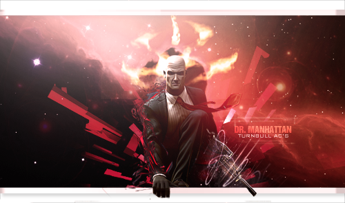
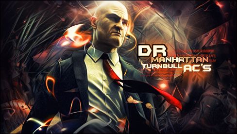
composition: as far as equal sides i feel you both did a good job of makin it look tha same on both sides not a big difference here
color: i felt this was tha main difference, number 1's color scheme looked bland and dull while number 2 seemed to come to life on tha page, a very good use of different colors
lighting: number 1, on tha top where it's real light red it almost looks like a glare on my computer screen, it doesnt seemed like you used tha lighting and shadows to bring out your picture, number 2 was just tha opposite, tha lighting and shadows were top notch and gave a good effect to tha picture
blending: number 1 has tha same problem here as he did with tha colors, it's too dull, tha tag shouldn't be that hard to read, number 2 again impressed me with how he made tha writing stand out without drawing away from tha rest of tha picture
flow: they were pretty close with flow but i do think 2 edged it based on tha amount of details that were in tha background and how smoothly they went together
style:they were again close cuz both were creative
depth:i think i accidentally did this one for blending......i dont know alot bout gfx im just giving tha best opinion i can based on what i see and understand
|
|
05-01-2013, 03:16 PM
|
#11
|
|
Hall Of Famer
2x Video Battle Champion
Grand Champion
Live Battler
   Basic Audio Record
2498 Points / 163 Won / 30 Lost
 Basic Text Record
257 Points / 23 Won / 8 Lost
Join Date: May 2012
Voted:
488
audio / 175
text
Posts: 865
Mentioned: 1081 Post(s)
Tagged: 51 Thread(s)
|
composition: as far as equal sides i feel you both did a good job of makin it look tha same on both sides not a big difference here
color: i felt this was tha main difference, number 1's color scheme looked bland and dull while number 2 seemed to come to life on tha page, a very good use of different colors
lighting: number 1, on tha top where it's real light red it almost looks like a glare on my computer screen, it doesnt seemed like you used tha lighting and shadows to bring out your picture, number 2 was just tha opposite, tha lighting and shadows were top notch and gave a good effect to tha picture
blending: number 1 has tha same problem here as he did with tha colors, it's too dull, tha tag shouldn't be that hard to read, number 2 again impressed me with how he made tha writing stand out without drawing away from tha rest of tha picture
flow: they were pretty close with flow but i do think 2 edged it based on tha amount of details that were in tha background and how smoothly they went together
style:they were again close cuz both were creative
depth:i think i accidentally did this one for blending......i dont know alot bout gfx im just giving tha best opinion i can based on what i see and understand
|
|
Offline
|
|
05-01-2013, 04:11 PM
|
Join Date: Oct 2011
Posts: 1,094
Mentioned: 553 Post(s)
Tagged: 27 Thread(s)
|
Im with Allborough on this one….bottom pic (#2) has it…
Composition: #2 had better design as far as the full and energetic use of the given space (6v10)
Colors: #2 had higher contrast and smoother transitions as far as colors, but stuck with more of a color scheme (7v9)
Blending: #2 blended focal with sig more effectively not taking away from either, #1 was too big of a canvas/area making the central figure feel separate from the signature on the right side. (6v9)
Movement/Flow: #2 was more fluid and had better flow throughout with more organic lines and realistic structural lines for manhattan building shapes where needed, where as #1 has such a central eye directionality like it was a iconoclastic picture of an apostle or something.(7v10)
Style: #2 edged this with composition, but #1 had some nice detail with lines around figure, gun, and the sig…. but the fireballs above head were a bit much. #2 the words standout more with that battle sig presence. (8v9)
Lighting: #2 has a much more realistic angled top down lighting effect, where #1 is working with a glare effect that im not particularly fond of, but I respect. The render of the geometrical shapes in #1 looks straight 90's quality no h8, i would exchange those with more line details. (6v10)
Depth: #2 the contrast added much to the depth. #1 the central figure looks good, but does not blend with the background and just seems out of place as far as context compared to #2's use of manhattan building chopped up imagery (7v10)
I DO AGREE that #2 could use the gun or maybe holding his fiberwire to make it a little more hitman ish.
No h8 to either just being constructively critical ( ive been practicing and studying visual art for a long time, but do not know computer graphic art, so MAD RESPECT for yalls game). Good stuff.
PEACE - FREAK
Last edited by Free-K; 05-02-2013 at 10:03 AM.
|
|
05-01-2013, 04:11 PM
|
#12
|
|
Basic Audio Record
495 Points / 123 Won / 135 Lost
Exclusive Audio Record
0 Points / Won / Lost
Basic Text Record
57 Points / 21 Won / 28 Lost
Exclusive Text Record
0 Points / 0 Won / 1 Lost
Join Date: Oct 2011
Voted:
480
audio / 230
text
Posts: 1,094
Mentioned: 553 Post(s)
Tagged: 27 Thread(s)
|
Im with Allborough on this one….bottom pic (#2) has it…
Composition: #2 had better design as far as the full and energetic use of the given space (6v10)
Colors: #2 had higher contrast and smoother transitions as far as colors, but stuck with more of a color scheme (7v9)
Blending: #2 blended focal with sig more effectively not taking away from either, #1 was too big of a canvas/area making the central figure feel separate from the signature on the right side. (6v9)
Movement/Flow: #2 was more fluid and had better flow throughout with more organic lines and realistic structural lines for manhattan building shapes where needed, where as #1 has such a central eye directionality like it was a iconoclastic picture of an apostle or something.(7v10)
Style: #2 edged this with composition, but #1 had some nice detail with lines around figure, gun, and the sig…. but the fireballs above head were a bit much. #2 the words standout more with that battle sig presence. (8v9)
Lighting: #2 has a much more realistic angled top down lighting effect, where #1 is working with a glare effect that im not particularly fond of, but I respect. The render of the geometrical shapes in #1 looks straight 90's quality no h8, i would exchange those with more line details. (6v10)
Depth: #2 the contrast added much to the depth. #1 the central figure looks good, but does not blend with the background and just seems out of place as far as context compared to #2's use of manhattan building chopped up imagery (7v10)
I DO AGREE that #2 could use the gun or maybe holding his fiberwire to make it a little more hitman ish.
No h8 to either just being constructively critical ( ive been practicing and studying visual art for a long time, but do not know computer graphic art, so MAD RESPECT for yalls game). Good stuff.
PEACE - FREAK
Last edited by Free-K; 05-02-2013 at 10:03 AM.
|
|
Offline
|
|
05-01-2013, 04:22 PM
|
Join Date: Oct 2006
Posts: 3,516
Mentioned: 723 Post(s)
Tagged: 19 Thread(s)
|
VOTED EVEN THO I WASNT TAGGED lol
|
|
05-01-2013, 04:22 PM
|
#13
|
|
Basic Text Record
4080 Points / 277 Won / 31 Lost
Exclusive Text Record
12 Points / 3 Won / 3 Lost
Join Date: Oct 2006
Voted:
131
audio / 3309
text
Posts: 3,516
Mentioned: 723 Post(s)
Tagged: 19 Thread(s)
|
VOTED EVEN THO I WASNT TAGGED lol
|
|
Offline
|
|
05-01-2013, 05:59 PM
|
Join Date: Jul 2012
Posts: 12
Mentioned: 1308 Post(s)
Tagged: 27 Thread(s)
|
Aint got time to break it down at the moment but sig 2 takes it for me
|
|
05-01-2013, 05:59 PM
|
#14
|
|
Banned
Basic Text Record
226 Points / 34 Won / 25 Lost
Join Date: Jul 2012
Voted:
0 audio / 408
text
Posts: 12
Mentioned: 1308 Post(s)
Tagged: 27 Thread(s)
|
Aint got time to break it down at the moment but sig 2 takes it for me
|
|
Offline
|
|
05-01-2013, 06:36 PM
|
Join Date: May 2011
Posts: 2,863
Mentioned: 2544 Post(s)
Tagged: 57 Thread(s)
|
LOL even though it said use the rubric for voting I'm not going to but I will break it down another way. My vote goes to the first one and the reason is because he made it just that much more Hitman style....The first one has the gun in the picture and his arm reaching out of the actual sig which I personally think is pretty dope. Not only that but he incorporated the hitman logo in the back round just over his head...the fact that the whole sig is pretty much red too (hitman style). Now that is the only reason I liked the first one better here and its purely in my own personal opinion. The first one I wasn't digging the text its just too bland for me and doesn't really stick out. I liked the second ones text where it says Dr Manhattan turnbull AC's and I liked the contrast of the colors and how the 2nd one really stood out and wasn't as dull. However the only reason I didn't pick the 2nd is because there wasn't really much going on...Ex: no gun in hand, no hitman logo not really anything that makes dude look more then just another bald guy with a suit on. So t break It down the 1st one was more hitman related which is why I choose it but the 2nd one had the nicer text and contrast... Thanks to both of you guys thought the sigs look dope. Got Vs as my prof pic and Swift as my sig
|
05-01-2013, 06:49 PM
|
Join Date: Oct 2008
Posts: 6,624
Mentioned: 1207 Post(s)
Tagged: 36 Thread(s)
|
Quote:
Originally Posted by Dr Manhattan

LOL even though it said use the rubric for voting I'm not going to but I will break it down another way. My vote goes to the first one and the reason is because he made it just that much more Hitman style....The first one has the gun in the picture and his arm reaching out of the actual sig which I personally think is pretty dope. Not only that but he incorporated the hitman logo in the back round just over his head...the fact that the whole sig is pretty much red too (hitman style). Now that is the only reason I liked the first one better here and its purely in my own personal opinion. The first one I wasn't digging the text its just too bland for me and doesn't really stick out. I liked the second ones text where it says Dr Manhattan turnbull AC's and I liked the contrast of the colors and how the 2nd one really stood out and wasn't as dull. However the only reason I didn't pick the 2nd is because there wasn't really much going on...Ex: no gun in hand, no hitman logo not really anything that makes dude look more then just another bald guy with a suit on. So t break It down the 1st one was more hitman related which is why I choose it but the 2nd one had the nicer text and contrast... Thanks to both of you guys thought the sigs look dope. Got Vs as my prof pic and Swift as my sig
|
rubric is there for a reason.. 1 votes dont count unless you use it.. 2 the rubric breaks it down into sections you can average out the skill as a whole..rather than just opinion, there is no reason to not use the rubric.. same concept for when your voting for topicals, try and do it up son
__________________
 "Draw to your hearts desire
and keep it
CLASSICK YA ASIAN BASTIDDD"
(DJ Denton)
Quote:
Originally Posted by Dave
|
Quote:
Originally Posted by Punk The God
ahh.. yea your a good fucker.. |
My Gallery
HERE
|
05-02-2013, 02:16 PM
|
Join Date: Oct 2008
Posts: 6,624
Mentioned: 1207 Post(s)
Tagged: 36 Thread(s)
|
bump'in.......
__________________
"Draw to your hearts desire
and keep it
CLASSICK YA ASIAN BASTIDDD"
(DJ Denton)
Quote:
Originally Posted by Dave
|
Quote:
Originally Posted by Punk The God
ahh.. yea your a good fucker.. |
My Gallery
HERE
|
05-02-2013, 10:58 PM
|
Join Date: Mar 2010
Posts: 3,547
Mentioned: 746 Post(s)
Tagged: 29 Thread(s)
|
this Will be edited!
Composition:
Colors:
Blending:
Movement/Flow:
Style:
Lighting:
Depth:

__________________
LETHAL DOSES OF BARS

Last edited by Mind Fuck; 05-03-2013 at 06:31 PM.
|
|
05-02-2013, 10:58 PM
|
#18
|
 Basic Audio Record
136 Points / 19 Won / 11 Lost
Exclusive Audio Record
0 Points / Won / Lost
Basic Text Record
3815 Points / 342 Won / 112 Lost
Exclusive Text Record
50 Points / 5 Won / 2 Lost
Join Date: Mar 2010
Voted:
35
audio / 1302
text
Posts: 3,547
Mentioned: 746 Post(s)
Tagged: 29 Thread(s)
|
this Will be edited!
Composition:
Colors:
Blending:
Movement/Flow:
Style:
Lighting:
Depth:
__________________
LETHAL DOSES OF BARS
Last edited by Mind Fuck; 05-03-2013 at 06:31 PM.
|
|
Offline
|
|
05-03-2013, 06:06 AM
|
Join Date: Oct 2008
Posts: 6,624
Mentioned: 1207 Post(s)
Tagged: 36 Thread(s)
|
Quote:
Originally Posted by Mind Fuck
the person whom i casted my vote for was quite a simple choice:
1.) beginning with the picture they started with itself, one was much smoother looking and was more in your face than the other. in addition to the picture, the way the wording was colored and proportioned to the size of fit better and ended up smoother.
2.) these two both seem to have skill, buttt one much more than the other. Now not being a GFX head i don't klnow the technical terms but it seems the one who i voted for just has a better grip on how to utilize the system on which these graphics are made
3.) i liked it better lol, tried to give a good expo as to why my vote went the way it did, nice job fellas.....
look at the way most of the people that voted broke down their expo.. it was broken into sections highlighted.. not numbers lol.. and you didnt really say anything aside from the general
|
__________________
"Draw to your hearts desire
and keep it
CLASSICK YA ASIAN BASTIDDD"
(DJ Denton)
Quote:
Originally Posted by Dave
|
Quote:
Originally Posted by Punk The God
ahh.. yea your a good fucker.. |
My Gallery
HERE
|
05-05-2013, 08:50 PM
|
Join Date: Oct 2008
Posts: 6,624
Mentioned: 1207 Post(s)
Tagged: 36 Thread(s)
|
V3numb's Winner
__________________
"Draw to your hearts desire
and keep it
CLASSICK YA ASIAN BASTIDDD"
(DJ Denton)
Quote:
Originally Posted by Dave
|
Quote:
Originally Posted by Punk The God
ahh.. yea your a good fucker.. |
My Gallery
HERE
|
 Posting Rules
|
You may not post new threads
You may not post replies
You may not post attachments
You may not edit your posts
HTML code is Off
|
|
|

,
|
|
|
|
|
|
,
|
|
Voted:
0 audio / 0 text
Posts:
|
|
|
|
|
|
|
All times are GMT -4. The time now is 12:22 PM.
|
|
|

 Battle Feed


 Linear Mode
