| |
|
View Poll Results: Round 3 Voting
|
1: 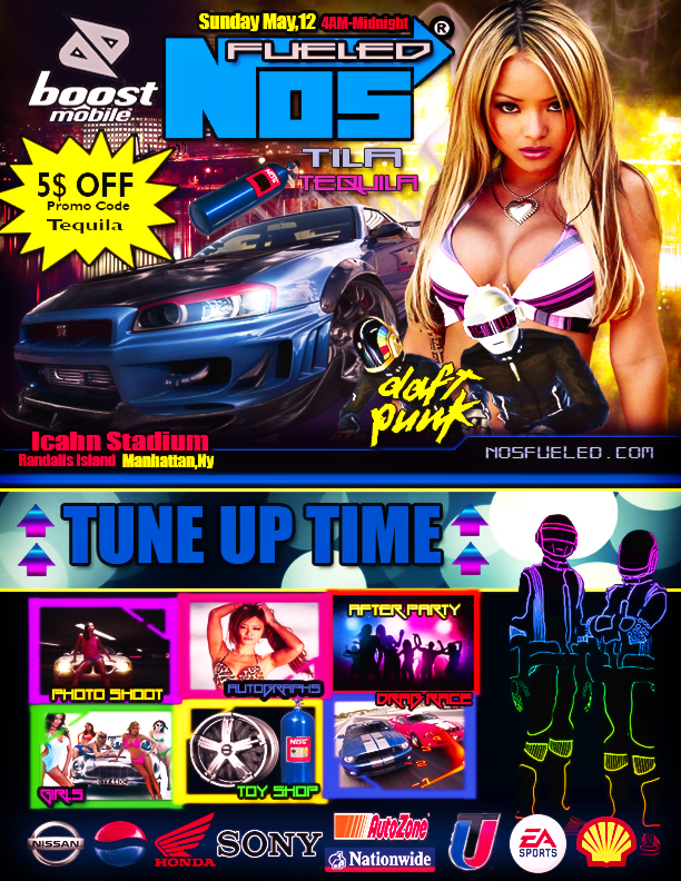 [/URL] [/URL]
|
   
|
5 |
62.50% |
2: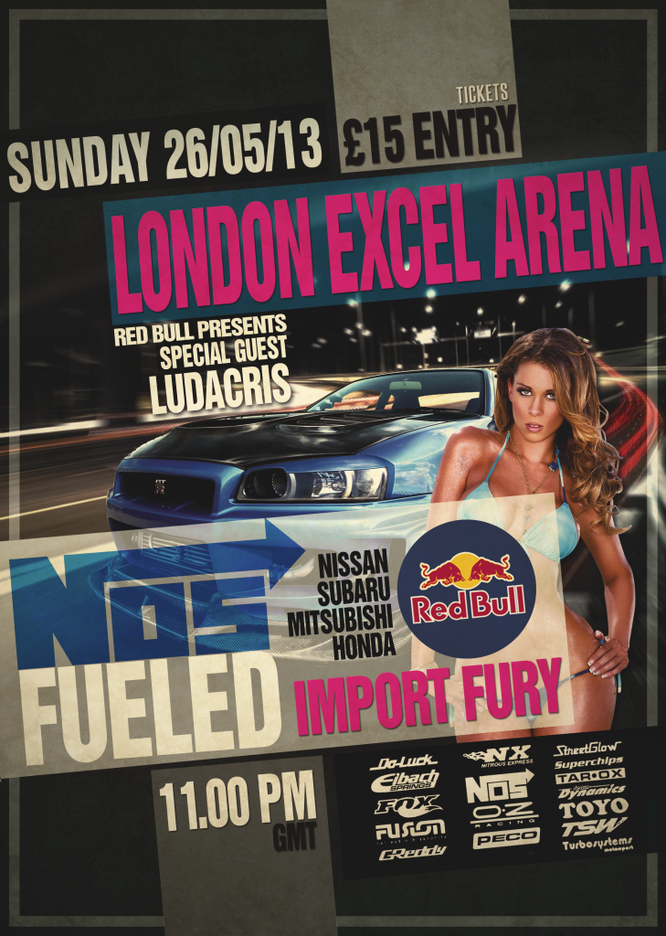
|
   
|
3 |
37.50% |

05-14-2013, 04:23 AM
|
Join Date: May 2011
Posts: 5,990
Mentioned: 3594 Post(s)
Tagged: 76 Thread(s)
|

Composition - I didn't like the composition of the first piece. I felt the divider (top and bottom) made it look like it was advertising two different events. The second piece had a lot more simple and together composition that suits my taste. Vote: number 2
Colors - It's hard to say which one I prefer. I felt the first one was definitely more vibrant, but almost to the point of annoyance. Those bright neon colors made me feel like I'm going to a techno rave or some shit. In the second piece, I think the blending made it slightly monotone, but the coloring of the titles and the renders gave it enough variation. Vote: number 2
Lighting- I think the first piece made a better use of lighting just based on the placement of objects. For example, its easy to imagine that the light shining off the car's front clip just behind the headlight is emanating from the glow behind the girl (Tia Tequila). At the same time, if the girl had a light source coming from behind her, you would expect her front to be a little shadowed and not be so bright...but whatever. I think it could have been more realistic, but it was still better planned than the second piece. Vote: number 1
Blending - I felt the second piece did a better overall job with blending--making all the objects look like they belong in the image. But it was almost overdone because, I don't know if it was a gradient map or an average blur with reduced opacity that was used, but while it prevented color clashes, it also decreased color variety and made the piece look slightly monotone. In the first piece, a lot of the objects just looked like they were pasted on the image. They looked well blended individually in the sense that their colors went with the overall image, but still looked like a bunch of renders slapped on top of one another. Vote: number 2
Flow - I felt the second piece had a nicer flow. The first piece feels like two different flyers to me. Top and bottom have a totally different feel and it sort of clashes. In the second pieces, the way the banners and wording are tilted goes with the track as well as the vehicle and the light streams that suggest motion. Its just a more consistent flow to me and it also helps draw attention to the focal point. Vote: number 2
Style - I was feeling the style in the second piece a lot more than in the first. In any event flyer, the most important information you want to get across is the date and the venue. In the first piece, the "Sunday May 12th 4AM-Midnight" was rather small. It was even smaller than the part that says "5$ off Promo code." "5$" should have been "$5" btw. After the date, the venue was all the way at the bottom of the first half of the flyer: "Icahn Stadium" If we're assuming that most people look at flyers sequentially from top to bottom, the date and venue should have been together rather than being so separate and the lettering should have been a bit more prominent. On the contrary, in the second piece, a big pink "London Excel Arena" is practically the first thing you see. You can't miss it. And the date was right above it, also in big bold letters. One thing I didn't like about the second piece though is it says "special guest Ludacris" but there's no picture of Luda. Ludacris is a VERY big draw. Using a sexy girl is generic for any event or club flyer. Sexy girls are like the universal marketing tool. When you're able to boast an actual star like Ludacris, you use his picture! Sexy girls are for when you don't really have a main draw. If I saw this flyer, I would think that Luda isn't really going to be there because a lot of people make flyers like that and put a big name just to draw people but don't use a picture of the famous person because they can more easily get sued that way for false advertising. But they can always claim they meant another "Ludacris" by just using the name. So not using the actual picture of Ludacris was a bad move to me. Vote: number 2
Depth - The second piece definitely had more depth. From the blurring highway signs and street lights of the background to the light streaks, car and tilting of the banners and lettering, everything suggests action and motion. The first piece seemed more flat in comparison. Vote: number 2
|
 05-14-2013, 04:23 AM
|
#11
|
          Basic Audio Record
59 Points / 4 Won / 0 Lost
          Basic Text Record
342 Points / 30 Won / 8 Lost
Join Date: May 2011
Voted:
406
audio / 1042
text
Posts: 5,990
Mentioned: 3594 Post(s)
Tagged: 76 Thread(s)
|

Composition - I didn't like the composition of the first piece. I felt the divider (top and bottom) made it look like it was advertising two different events. The second piece had a lot more simple and together composition that suits my taste. Vote: number 2
Colors - It's hard to say which one I prefer. I felt the first one was definitely more vibrant, but almost to the point of annoyance. Those bright neon colors made me feel like I'm going to a techno rave or some shit. In the second piece, I think the blending made it slightly monotone, but the coloring of the titles and the renders gave it enough variation. Vote: number 2
Lighting- I think the first piece made a better use of lighting just based on the placement of objects. For example, its easy to imagine that the light shining off the car's front clip just behind the headlight is emanating from the glow behind the girl (Tia Tequila). At the same time, if the girl had a light source coming from behind her, you would expect her front to be a little shadowed and not be so bright...but whatever. I think it could have been more realistic, but it was still better planned than the second piece. Vote: number 1
Blending - I felt the second piece did a better overall job with blending--making all the objects look like they belong in the image. But it was almost overdone because, I don't know if it was a gradient map or an average blur with reduced opacity that was used, but while it prevented color clashes, it also decreased color variety and made the piece look slightly monotone. In the first piece, a lot of the objects just looked like they were pasted on the image. They looked well blended individually in the sense that their colors went with the overall image, but still looked like a bunch of renders slapped on top of one another. Vote: number 2
Flow - I felt the second piece had a nicer flow. The first piece feels like two different flyers to me. Top and bottom have a totally different feel and it sort of clashes. In the second pieces, the way the banners and wording are tilted goes with the track as well as the vehicle and the light streams that suggest motion. Its just a more consistent flow to me and it also helps draw attention to the focal point. Vote: number 2
Style - I was feeling the style in the second piece a lot more than in the first. In any event flyer, the most important information you want to get across is the date and the venue. In the first piece, the "Sunday May 12th 4AM-Midnight" was rather small. It was even smaller than the part that says "5$ off Promo code." "5$" should have been "$5" btw. After the date, the venue was all the way at the bottom of the first half of the flyer: "Icahn Stadium" If we're assuming that most people look at flyers sequentially from top to bottom, the date and venue should have been together rather than being so separate and the lettering should have been a bit more prominent. On the contrary, in the second piece, a big pink "London Excel Arena" is practically the first thing you see. You can't miss it. And the date was right above it, also in big bold letters. One thing I didn't like about the second piece though is it says "special guest Ludacris" but there's no picture of Luda. Ludacris is a VERY big draw. Using a sexy girl is generic for any event or club flyer. Sexy girls are like the universal marketing tool. When you're able to boast an actual star like Ludacris, you use his picture! Sexy girls are for when you don't really have a main draw. If I saw this flyer, I would think that Luda isn't really going to be there because a lot of people make flyers like that and put a big name just to draw people but don't use a picture of the famous person because they can more easily get sued that way for false advertising. But they can always claim they meant another "Ludacris" by just using the name. So not using the actual picture of Ludacris was a bad move to me. Vote: number 2
Depth - The second piece definitely had more depth. From the blurring highway signs and street lights of the background to the light streaks, car and tilting of the banners and lettering, everything suggests action and motion. The first piece seemed more flat in comparison. Vote: number 2
|
|
Offline
|
|

05-15-2013, 05:15 AM
|
Join Date: Oct 2008
Posts: 6,624
Mentioned: 1207 Post(s)
Tagged: 36 Thread(s)
|
bUmP.........
__________________
 "Draw to your hearts desire
and keep it
CLASSICK YA ASIAN BASTIDDD"
(DJ Denton)
Quote:
Originally Posted by Dave

|
Quote:
Originally Posted by Punk The God

ahh.. yea your a good fucker.. |
My Gallery
HERE

|

05-18-2013, 06:53 PM
|
Join Date: Mar 2010
Posts: 3,547
Mentioned: 746 Post(s)
Tagged: 29 Thread(s)
|
@ V3numb
this round over.. riight?

__________________
LETHAL DOSES OF BARS


|

05-18-2013, 10:01 PM
|
Join Date: Oct 2008
Posts: 6,624
Mentioned: 1207 Post(s)
Tagged: 36 Thread(s)
|
round closed V3numb wins
__________________
 "Draw to your hearts desire
and keep it
CLASSICK YA ASIAN BASTIDDD"
(DJ Denton)

Quote:
Originally Posted by Dave

|
Quote:
Originally Posted by Punk The God

ahh.. yea your a good fucker.. |
My Gallery
HERE

|
 Posting Rules
|
You may not post new threads
You may not post replies
You may not post attachments
You may not edit your posts
HTML code is Off
|
|
|

,
|
|
|
|
|
 ,
,
|
|
Voted:
0 audio / 0 text
Posts:
|
|
|
|
|
|
|
All times are GMT -4. The time now is 05:18 PM.
|
|
|
 Battle Feed


 [/URL]


 Linear Mode

